
In a world crowded with brands, dozens of logos might pass us by daily without us giving them a second thought. But some logos leave a different impression; they feel as if they speak to you silently, instilling a sense of trust even before you try the product itself. This isn't a coincidence; it's the result of a deep understanding of the logo's role as a message, not merely an ornament.
The Darbk logo wasn't designed to be just a pretty shape placed on a tire or package. Instead, it's a shorthand for a complete identity, a clear vision, and an unwritten promise to the driver. In this article, we'll take you on a creative journey to understand the meaning behind the Darbk logo, why it looks the way it does, and how it reflects the company's direction and mission on the road.
What is a commercial logo? And why is it truly important?
Before we delve into the specific meaning of the Darbk logo, it's important to pause for a moment and consider the concept of a logo itself. Many view a logo as a secondary visual element, when in reality, it's the cornerstone of any company's identity. The logo is the first point of contact between a brand and its audience, and it's through it that initial impressions are formed—impressions that are difficult to change later.
- A logo, in simple terms:
A logo is the first thing people see from any company. It's the symbol that precedes the experience, forms the customer's first impression, and remains present in memory even after use. Simply put, a logo is the face of a company, the fastest way to say who you are without uttering a word.
- Why do people care about logos without realizing it?
The human mind naturally gravitates towards simple and clear symbols. When it sees a harmonious and strong logo, it automatically associates it with quality, organization, and professionalism. Therefore, a good logo doesn't convince you with words, but with feeling.
What do major companies invest in their logo design?
Major companies don't spend time and money on logo design in vain; they view the logo as a long-term investment in their brand's reputation. They understand that the logo will live with them for many years, accompanying the product in every advertisement, every marketing campaign, every user experience, and will even be present in the customer's mind with every new purchasing decision.
A successful logo's role isn't limited to identifying the company; it performs several essential functions simultaneously:
- It identifies the company in seconds:
In a fast-paced world, customers don't have much time to get to know brands. A strong logo condenses the entire story into a single moment, leaving a clear and memorable impression.
- It distinguishes it from competitors:
Amidst similar products and overlapping offers, the logo becomes the visual element of distinction that separates one brand from another, giving it a unique personality recognizable at first glance.
- It creates an emotional connection with the customer:
With repeated positive experiences, the logo transforms into a symbol of trust and reassurance. Customers feel an inner comfort when they see it, as they associate it with previous good experiences.
And this is precisely what Darbk has aimed for from the beginning: for its logo to be more than just an identifying mark, but a symbol that encapsulates quality, reliability, and a sense of confidence on the road.
The Story of the Darbk Logo: Why It Wasn't a Random Shape
The Darbk logo was born from the road environment, not from a design office isolated from reality. The road is a place of movement, risk, trust, and self-reliance. Therefore, the logo had to reflect these values without complexity or exaggeration.
The core idea was clear: a single-color logo with flowing typography resembling a road: clear, straightforward, and reliable.
What does the name "Darbk" represent?
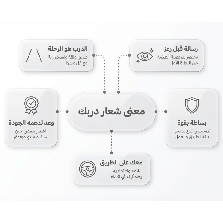
- Al-Darb = The Road:
The road is the space where a driver spends long hours. It is a place of work, travel, livelihood, and safe return home. When you say "Darbk," you are referring to your own specific road.
- Al-Darb = The Journey:
Every driver has their own journey, whether it's a short one within the city or a long one between cities and locations. Darbk doesn't just sell a tire; it accompanies you on this journey.
- Al-Darb = Trust:
Choosing the right path means trusting the decision. And the name Darbk reflects this meaning: We are with you on the path you have chosen.
Analyzing the elements of the Darbk logo:
Having understood the meaning of the name and the general background of the logo, we will now break down its visual elements in a simplified manner. Every line, every color, and every detail in the Darbk logo was not chosen by chance; rather, it was selected to serve a specific message and reflect the company's character and values on the road.
- Deliberate Simplicity:
The Darbk logo is characterized by clarity and simplicity, without complex details. This simplicity is not a deficiency, but a message: the product is clear, the identity is authentic, and there's no need for excessive embellishment.
- Strength Without Aggression:
The font used in the logo suggests strength and stability, yet it doesn't appear harsh or arrogant. This is an important point, as Darbk aims to present itself as a reliable partner, not an arrogant brand.
- Colors and Their Meaning:
The chosen colors reflect stability, safety, and practicality. They are familiar colors on the road, making the driver feel reassured, not anxious.
How does the Darbk logo reflect the company's mission?
Darbk's mission is clear: to provide tires that drivers can rely on in various road conditions. This mission is not just written in a brochure; it is visually and psychologically reflected in the logo itself. The logo here is not merely a decorative element, but a concise translation of the company's philosophy and its approach to drivers and the road.
This is what the Darbk logo reflects through several key meanings:
Clarity
The straightforward and uncomplicated logo design reflects Darbk's commitment to honesty and not overpromising. The brand doesn't try to say more than it can deliver; instead, it favors clarity that reassures the driver from the first glance.
Stability
The logo's strong and balanced presence suggests reliability and stability. There's no visual clutter or distracting elements, just a calm message that Darbk is there to perform its role steadfastly, exactly as expected from a tire on the road.
Longevity
The logo's simplicity and its ability to withstand the test of time reflect a long-term vision. Darbk isn't seeking temporary attention; instead, it aims to build a brand that can accompany drivers for many years without losing its meaning or value.
In this way, the logo becomes a natural extension of Darbk's mission, transforming the written vision into a tangible feeling that accompanies the driver on every journey.
The Logo and its Relationship to Product Quality
After discussing the meanings and values embodied by the Darbk logo, a fundamental question remains that cannot be ignored: What is the value of a logo if it doesn't reflect the quality of the product itself? The relationship between the logo and tire quality is a delicate one, because, in the customer's eyes, the logo isn't a theoretical promise, but a practical expectation of real performance on the road.
Why isn't a beautiful logo enough on its own?
Many brands have attractive logos, but they fail because the product doesn't live up to the image. Darbk chose the harder path: for the logo to be a reflection of genuine quality, not a cover-up.
How does Darbk uphold its logo in practice?
By focusing on manufacturing quality, testing, and adherence to specifications, the logo becomes a promise that can be tested on the road, not just a drawing.
How does the Darbk logo speak to the driver indirectly?
When a driver sees the Darbk logo on the tire, they feel that someone has thought of them:
- thought of their safety.
- thought of their driving comfort.
- thought that the tire will be with them in difficult conditions.
This feeling doesn't come from words, but from the visual identity itself.
The Logo as Part of Darbk's Complete Identity
Darbk's logo doesn't operate in isolation, but as part of a system that includes:
- The product itself.
- The way the tire is presented.
- Customer communication style.
- After-sales service.
All these elements come together to convey a single message: We are here to be part of your journey.
Why is it important for you, as an individual or a company, to understand Darbk's logo?
Understanding the logo means understanding the company's mindset. When you choose Darbk, you are not just choosing a product, but a vision based on clarity, commitment, and continuity.
The logo that sells… and the logo that endures
Some logos are designed to attract temporary attention, then disappear. Others are designed to remain in memory and grow over time. Darbk chose to be the latter.
Darbk's message through its logo:
We are not just a tire; we are part of your journey. We are with you on the road, step by step.
In conclusion...
Darbk's logo is not just a visual symbol, but the essence of a complete philosophy. It is a sincere expression of a company that believes the journey is a responsibility, and that trust is built through action before appearance.
When you see Darbk's logo, you don't just see a design, but a promise:
That your journey will be safer, more stable, and on a clear, reliable path..


